
728x90
Data Visualization
데이터 시각화가 필요한 이유
1) 정보를 더 쉽게 전달
2) 듣는 사람이 더 쉽게 이해 => 빠른 의사결정
시각화는 빅데이터 시대에 필수적이다!
Matplotlib
Matplotlib 패키지는 파이썬에서 데이터 시각화를 할 때 가장 유명한 라이브러리입니다!
간단한 실습을 해보겠습니다.
import matplotlib.pyplot as plt
values=[1,5,7,8,2,0,3,10,4,7]
plt.plot(range(1,11), values)
1. Axis, Ticks and grids
# 차트의 틀을 만들음
ax=plt.axes()

# x축에 0~11 / y축에 -1~11
ax.set_xlim([0,11])
ax.set_ylim([-1,11])

# x눈금 / y눈금 지정
ax.set_xticks([1,2,3,4,5,6,7,8,9,10])
ax.set_yticks([0,1,2,3,4,5,6,7,8,9,10])
# 차트에 수치를 집어넣음
plt.plot(range(1,11), values)
#격자 추가-> 데이터 포인트 파악을 위해
ax.grid()
2. line styles
plt.plot(range(1,11), values, 'r') #빨간색
plt.plot(range(1,11), values2,'b') #파란색
plt.plot(range(1,11), values3,'y') #노란색
plt.plot(range(1,11), values4,'g') #초록색
plt.plot(range(1,11), values, 'c') #하늘색
plt.plot(range(1,11), values2,'m') #보라색
plt.plot(range(1,11), values3,'k') #검은색
+ line 대신에 point(점)으로 표현 가능!
# 점으로 변경 가능
plt.plot(range(1,11), values, '.') #그냥점
plt.plot(range(1,11), values2, 's') #Square=>정사각형
plt.plot(range(1,11), values3, 'o') #원
plt.plot(range(1,11), values4, 'v') #역삼각형plt.plot(range(1,11), values, '*') #*
plt.plot(range(1,11), values2, '+') #+
plt.plot(range(1,11), values3, 'x') #x
plt.plot(range(1,11), values4, 'D') #Diamond=>마름모
3. text 추가하기
# x축명, y축명 지정
values = [1, 5, 8, 9, 2, 0, 3, 10, 4, 7]
plt.xlabel('Entries')
plt.ylabel('Values')
plt.plot(range(1,11), values)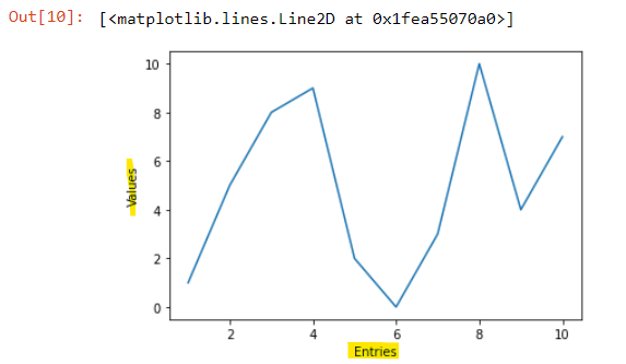
x축명 및 y축명이 지정된 것을 확인할 수 있다!
+잘 쓰이진 않지만 주석 추가하는 방법
# 원하는 위치에 text 추가
values = [1, 5, 8, 9, 2, 0, 3, 10, 4, 7]
plt.text(1,1, 'First Entry')
plt.text(5,8,'Off the tangent')
plt.plot(range(1,11), values)
~범례 추가하기~
values = [1, 5, 8, 9, 2, 0, 3, 10, 4, 7]
values2 = [3, 8, 9, 2, 1, 2, 4, 7, 6, 6]
plt.plot(range(1,11), values, label="first")
plt.plot(range(1,11), values2)
plt.legend(['First', 'Second'], loc=4)
plt.legend()함수는 범례를 추가한다는 의미!
loc=1/2/3/4 옵션을 줄 수 있는데
숫자 1,2,3,4는 범례의 위치를 말하며, 1 : 오른쪽 상단 / 2: 왼쪽 상단 / 3 : 왼쪽 하단 / 4 : 오른쪽 하단
4. PIE CHART
# Pie Chart
values = [5, 8, 9, 10, 4, 7]

# 색지정
colors = ['b', 'g', 'r', 'c', 'm', 'y']

# 컬럼명
labels = ['A', 'B', 'C', 'D', 'E', 'F']

# 간격지정 / B만 튀어나오게 0.2로 값 지정
explode = (0, 0.2, 0, 0, 0, 0)

# autopct='%1.1f%%' -> 소수점 한자리까지 %로 표기하겠다는 의미
plt.pie(values, colors=colors, labels=labels,explode=explode, autopct='%1.1f%%')
plt.title('Values')
5. Bar Graph
# Bar graph
values = [5, 8, 9, 10, 4, 7]

# 넓이 -> B만 강조
widths = [0.7, 0.8, 0.7, 0.7, 0.7, 0.7]

# color -> B만 빨간색
colors = ['b', 'r', 'b', 'b', 'b', 'b']

plt.bar(range(0, 6), values, width=widths, color=colors, align='center')
6. Histogram
# Histogram
import numpy as np
np.random.seed(0)
x = 20 * np.random.randn(10000)

plt.hist(x, 25, range=(-50, 50), histtype='stepfilled',
align='mid', color='g', label='Test Data')

# 범례
plt.legend()
# 제목 지정
plt.title('Step Filled Histogram')
728x90
'🔍 데이터 분석 > 03. Data Visualizaton' 카테고리의 다른 글
| [데이터 시각화] 시각화 실습 - 4 by 4 scatter plot (0) | 2022.03.05 |
|---|---|
| [데이터 시각화] 시각화 실습 - Scatter plot (0) | 2022.03.02 |
| [데이터 시각화] 시각화 실습 - Bar graph (0) | 2022.03.02 |
| [데이터 시각화] 시각화 실습 - Pie chart (0) | 2022.03.01 |
| [데이터 시각화] 1. MATPLOTLIB(2) (0) | 2022.03.01 |